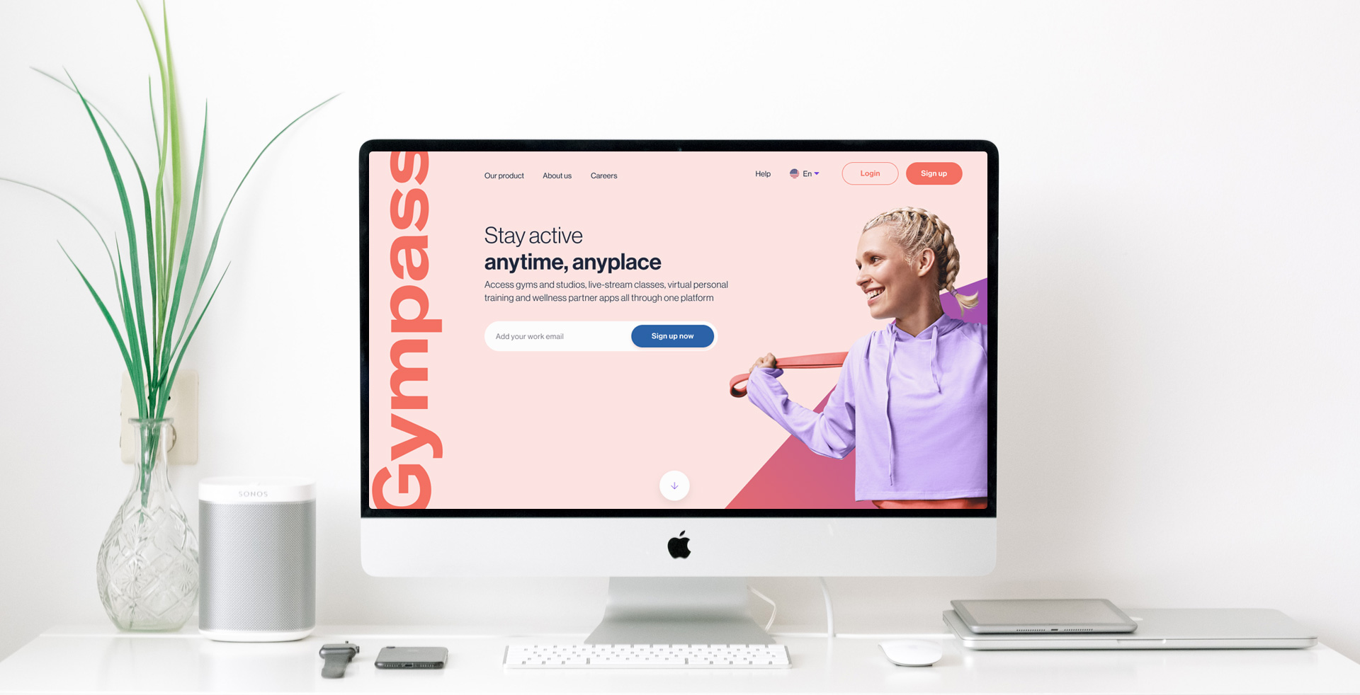
Gympass is a wellness platform that partners with companies to offer their employees access to the world's largest global network of fitness facilities. The conversion rate on the home page has been notably low, thus the objective of this project is to boost the sign-up conversion rate.
A significant problem we faced with Gympass's landing pages was the utilization of a single landing page for all our diverse user types. The 'one size fits all' strategy proved ineffective. As a solution, we decided to first identify the specific needs of our users. Subsequently, based on our UX workshop, we devised user flows tailored to these needs.
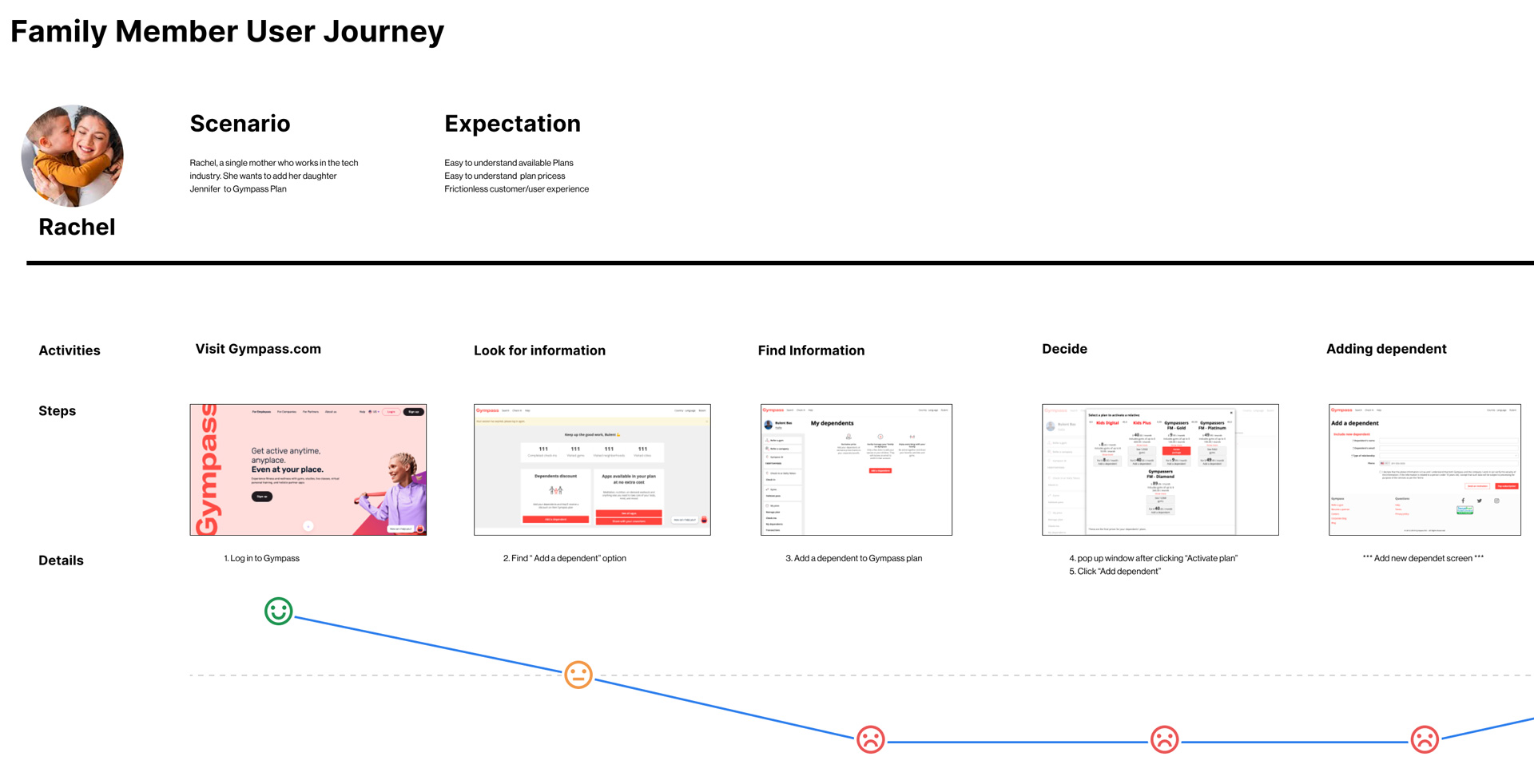
Once we identified the key touchpoints for our users through user journeys, it became significantly easier to find solutions.
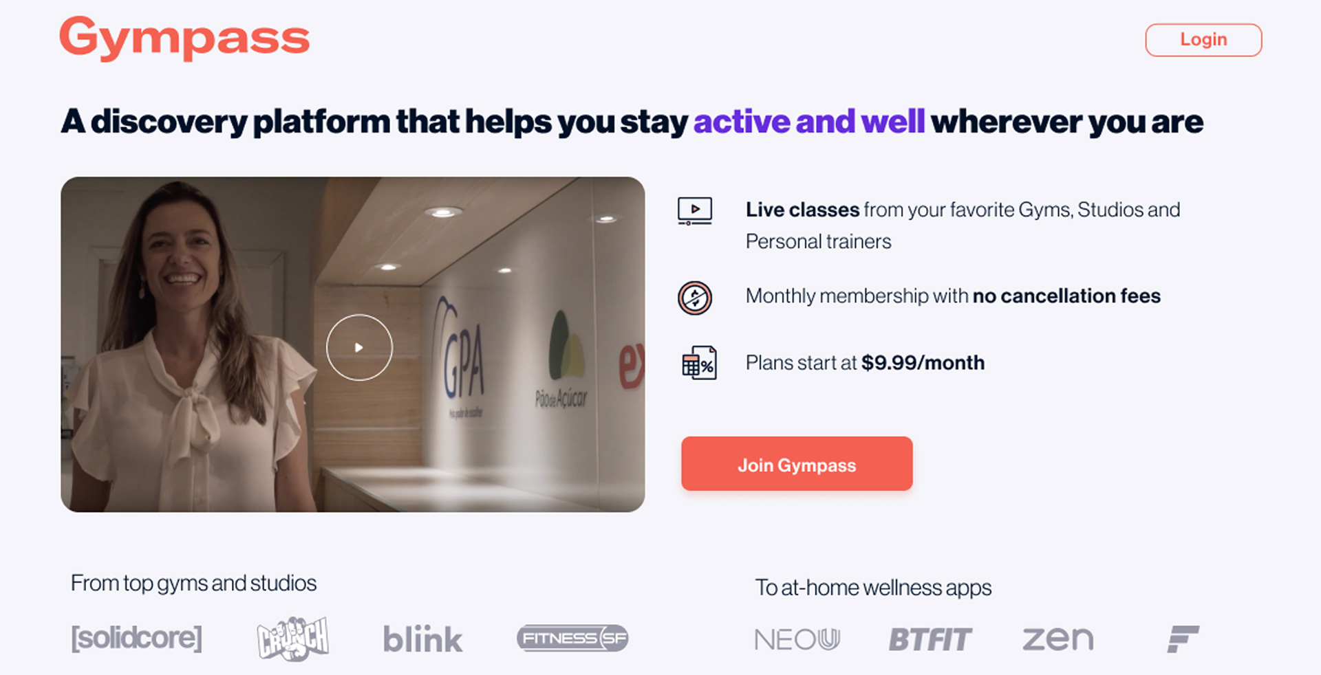
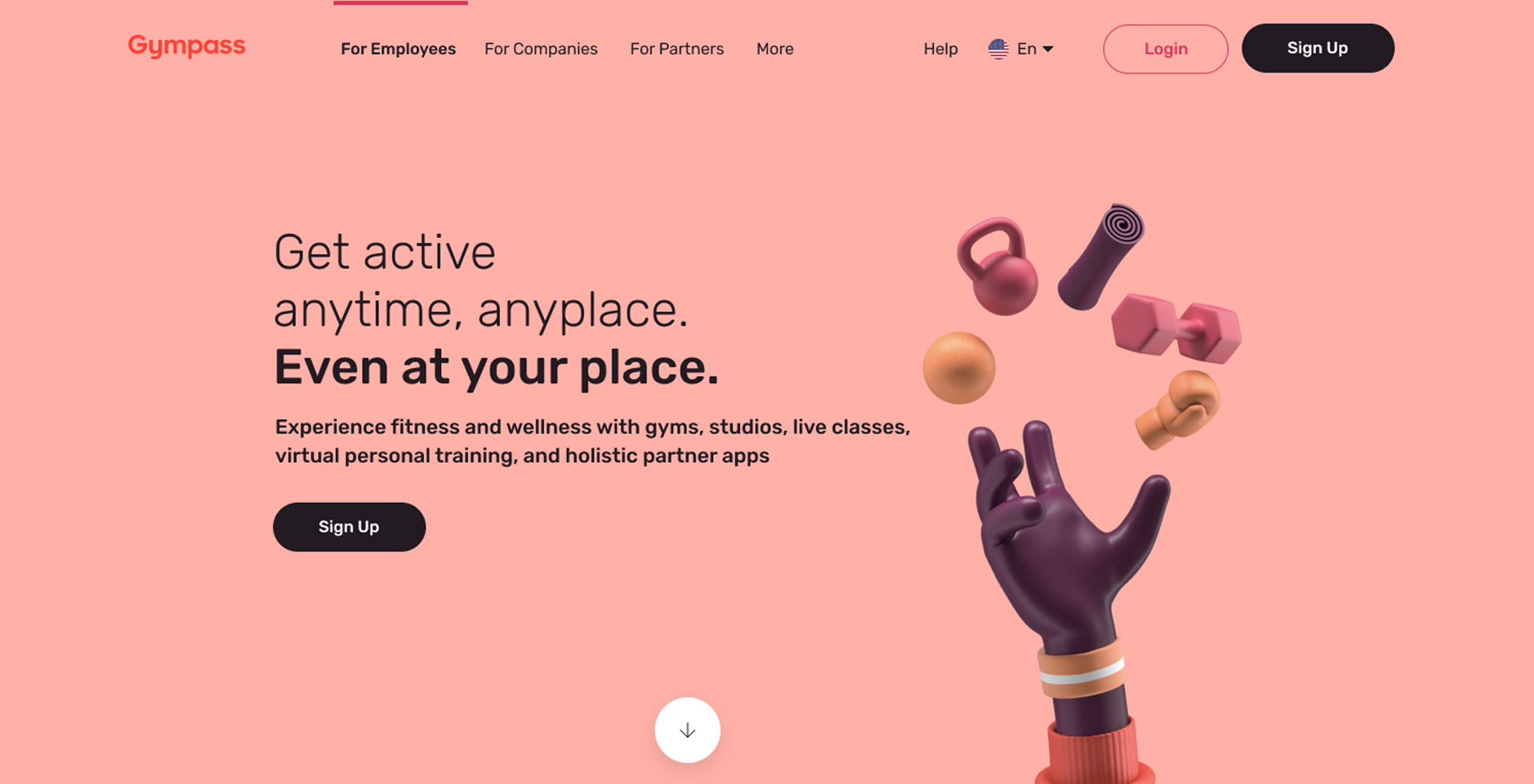
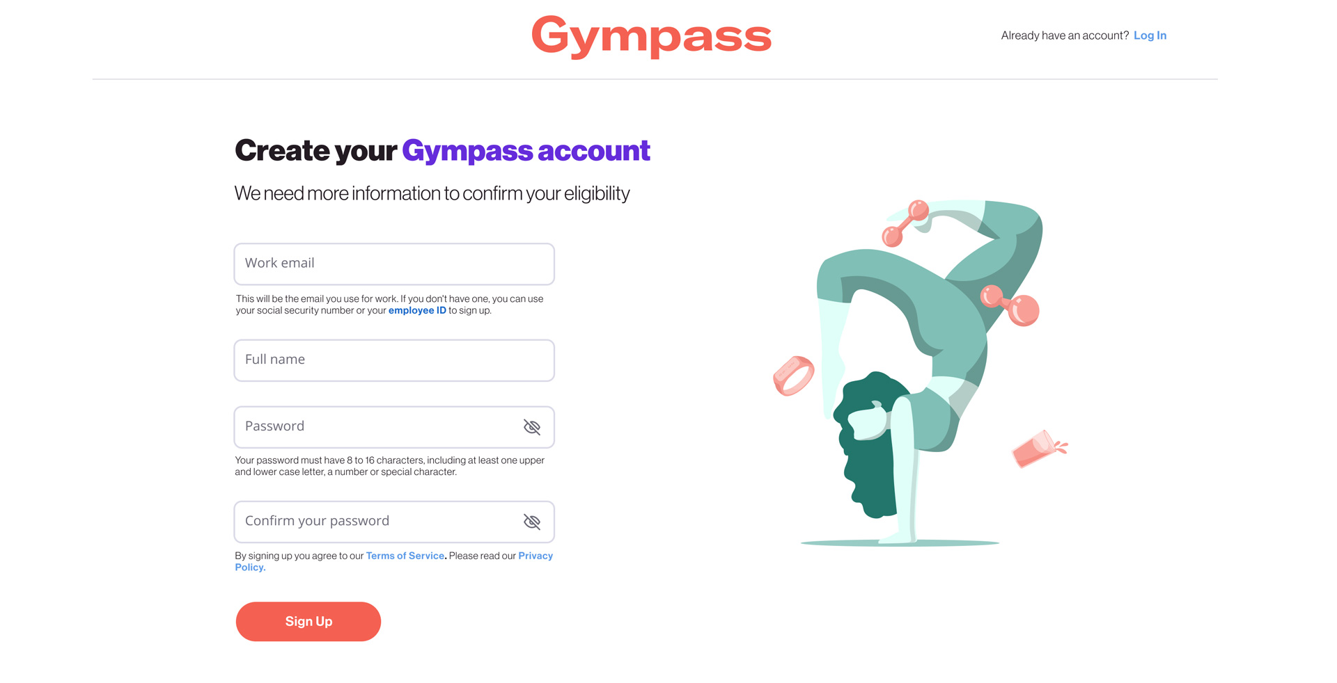
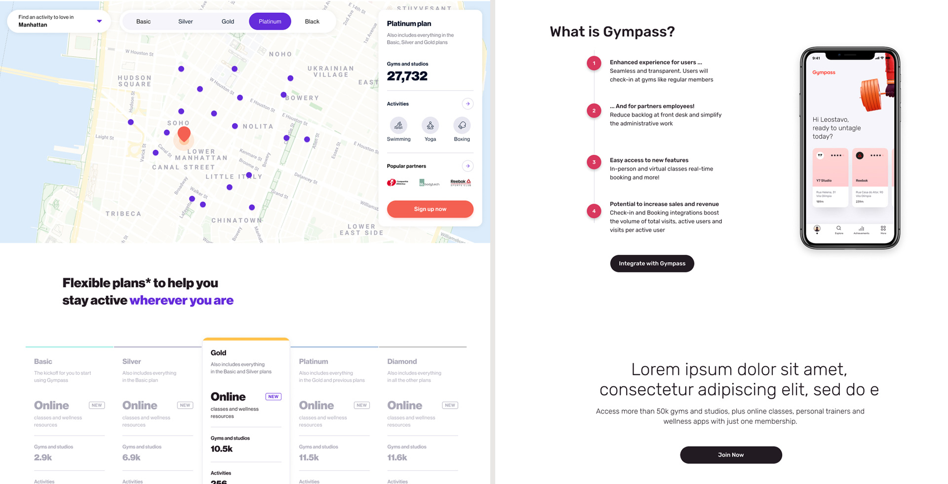
Upon interacting with current Gympass users through usertesting.com, it became evident that the majority couldn't comprehend Gympass's value proposition, leading to confusion about our services. To counteract this, I crafted several landing page wireframes and initiated testing with our users..
As soon as I began noticing encouraging results from the usability tests conducted on usertesting.com, I formulated A/B test versions of the wireframes. This allowed us to start testing variations in copy and imagery.
Utilizing the design system, I developed numerous variants of design modules and initiated A/B testing. The outcomes were impressive, resulting in a 5 to 10% increase in the conversion rate first months'