Bed Bath & Beyond, founded in 1971 and based in Union, New Jersey, is a prominent American retail chain with over 1,200 stores in the U.S. and Canada. Known for its extensive product range, competitive pricing, and in-store services like gift wrapping and custom engraving.

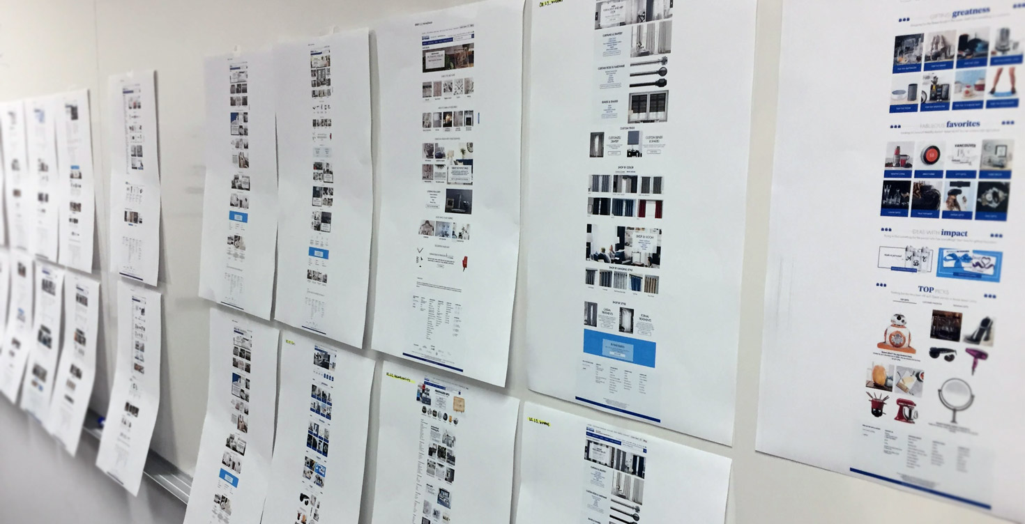
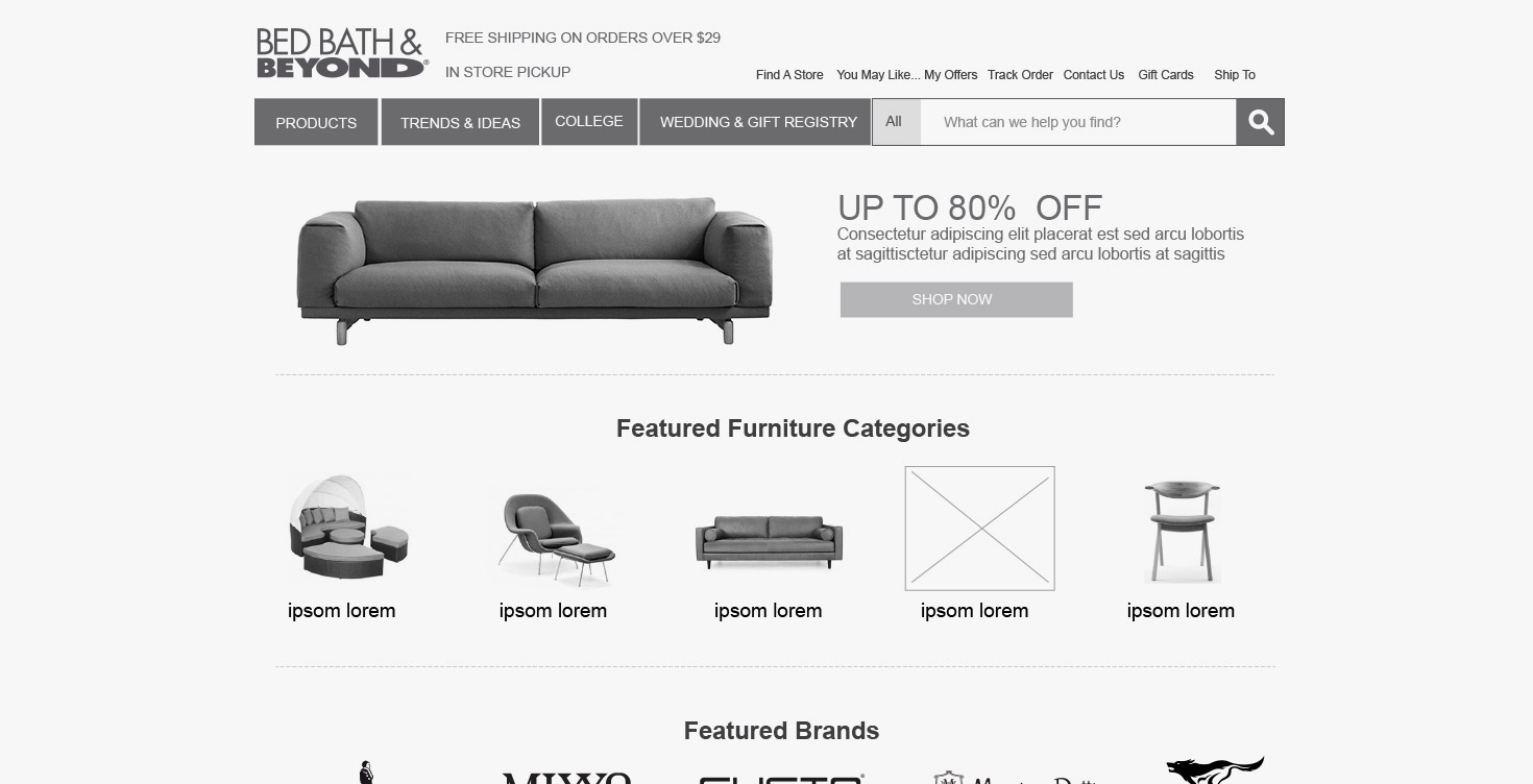
We focused on redesigning the furniture section of the Bed Bath & Beyond website, taking inspiration from competitors’ designs. Initially, the user engagement with the page was brief, indicating a need for improvement in user experience. Most users quickly located their desired products and proceeded to the checkout page.
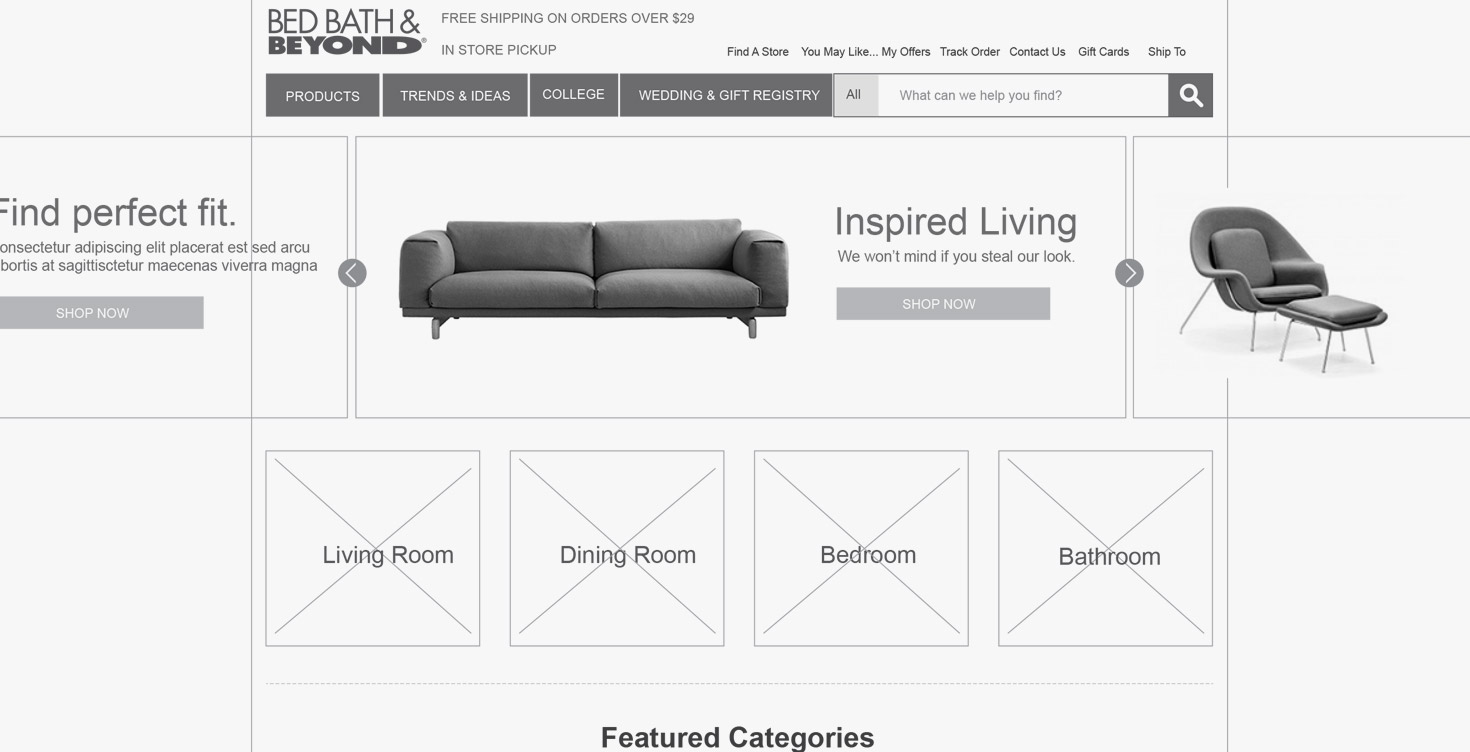
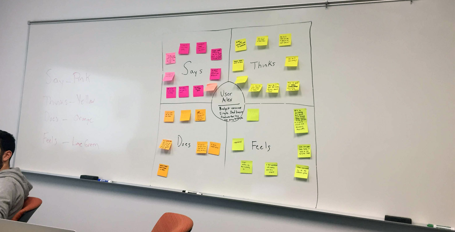
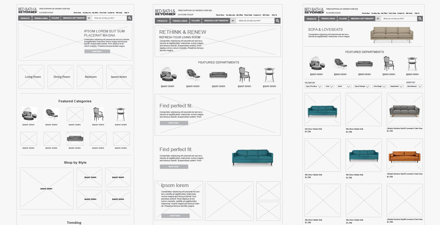
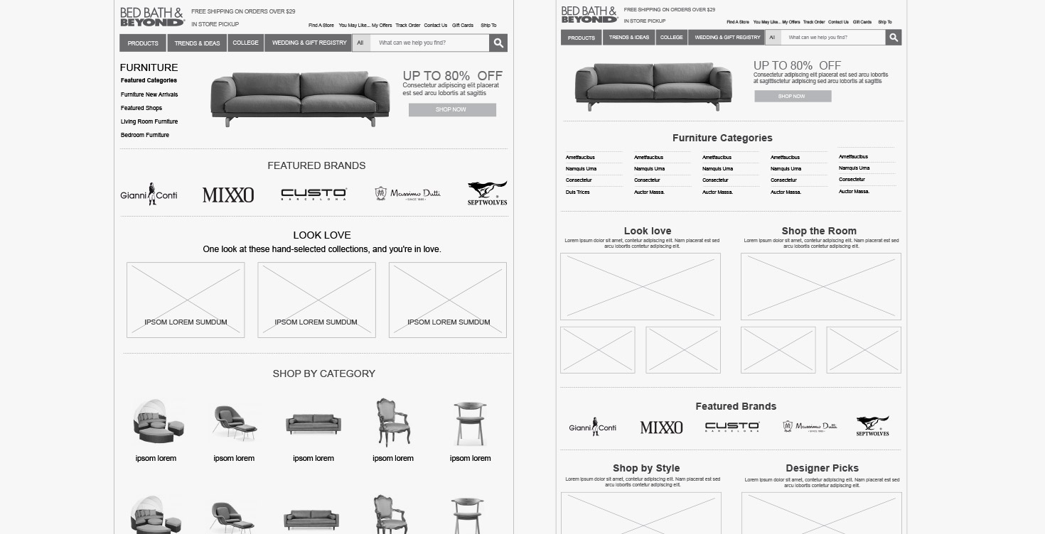
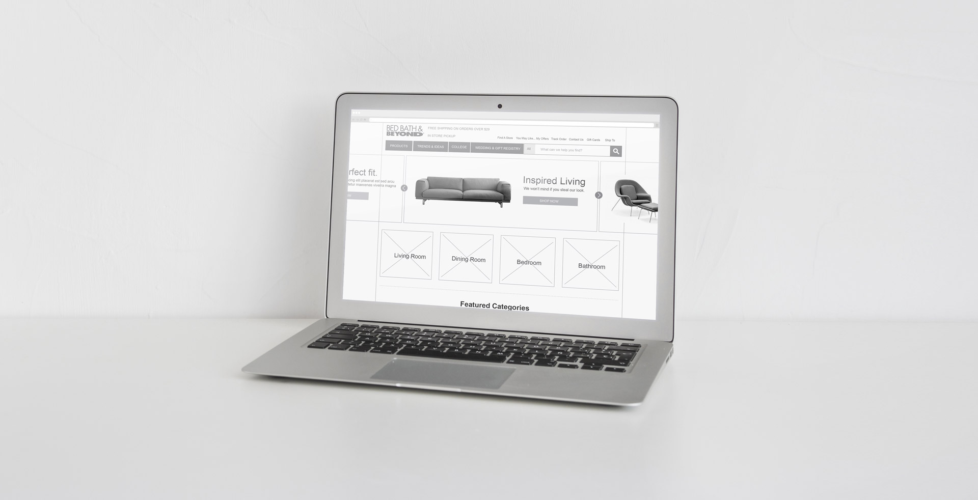
Our primary objective for the new design was to encourage users to spend more time exploring inspirational content. To achieve this, we initiated a design thinking workshop in collaboration with stakeholders. After gaining consensus from potential users, we began the redesign process for the furniture page during the workshop. We created multiple wireframe prototypes and conducted real-user testing, using their feedback to make minor adjustments. This iterative process led us to transition into the visual design phase. The results were impressive, with a 35% increase in user engagement observed on the newly designed page, accompanied by an initial boost of $15 in sales.
